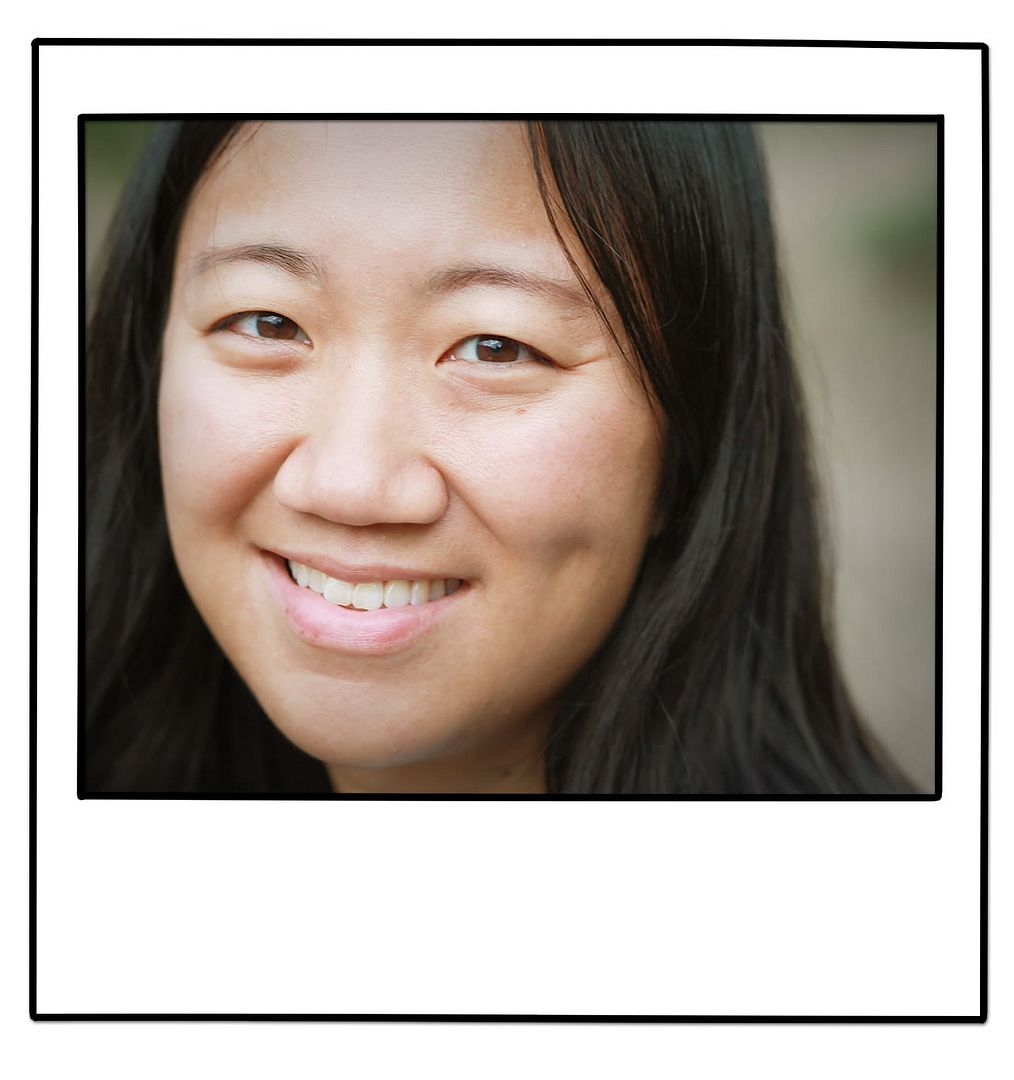
I love playing other photographers' pictures, especially when the subject is as beautiful as this one!
This is my basic workflow in CS4:
1. USM 20/60/0 to defog
2. Adjust Color Balance to taste
3. Duplicate layer, change to Soft Light and adjust opacity to desired contrast (I am usually around 65%) then flatten
4. Ctrl-L (in Windows) to open Levels and adjust middle slider to taste
From there I might play around Hue/Sat a bit, sharpen the eyes or warm up the picture a bit more, depending on what the picture needs. This week's edit took less than 2 minutes. I really like the warm, colorful and natural look.
Then I challenged myself to play a bit with a digital layout.
I'm very much a traditional paper and paste scrapbooker, needing to touch and push pieces around FOREVER until they finally look right to me. But hey, I can do that on my monitor, too...AND get in those FB breaks while I'm at it! Gotta love multi-tasking!
Template by Amy Martin, digital elements by Lauren Reid.


0 comments:
Post a Comment